Wes
Anderson.
Art direction - Alex Kaminski
Design - Alex Kaminski
Animation - Alex Kaminski

Goal.
Design a mobile website for a Wes Anderson’s film festival. Focusing on Wes Anderson's aesthetics: centered, flat with high imagery.
Synopsis.

Wes Anderson is an American film director. His films are known for its distinctive visual and narrative styles.
Houston Cinema Art Festival is hosting a Wes Anderson film festival in 2020. A website is needed to guide customers through information about film schedules, venue, screenings and tickets.
Structure.

User Persona.

Age: 22
Pronoun: He/Him
Gender: Male
Status: Single
Occupation: Student
Location: Houston
A film student from Houston, Texas, currently studying at Film Connection Film Institute. Spends his time filming content with his friends around town. Enjoys the process of editing.

Interest.
-
Filming
-
Watching videos
-
Wes Anderson Films
-
Editing videos
Pain Points.
-
Social Anxiety
-
Quiet
-
Spends too much time on his laptop
User Needs.
-
To spend more time with his friends
-
To go out
-
To gain inspiration
Scenario.
He is busy with finals at school, but is lacking inspiration. He's been seeing his school promote the Houston Cinema Arts Festival this year and plans to attend the Wes Anderson Film Festival to gain inspiration but to also spend time with his two close friends. He needs to search up information about the event, so he finds a website for this event and is able to gain information about the screenings, time, venue and how to buy tickets.
Website Features.
Typography.

Color.

Navigation.
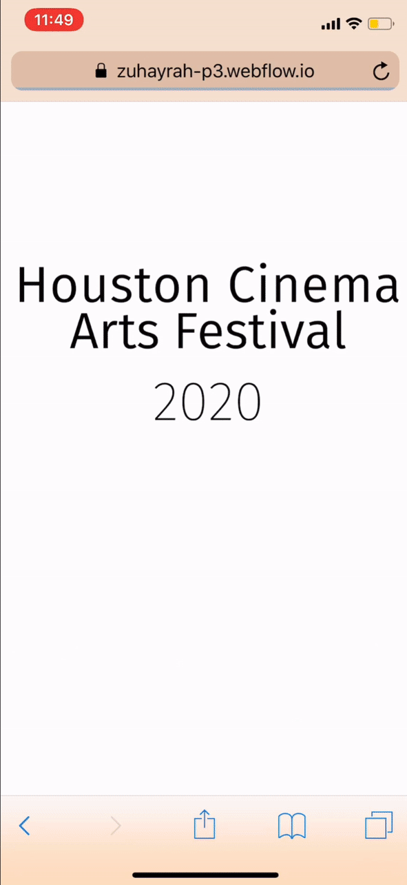
An introduction gif is the first thing that the user sees once the page is loaded. When scrolling down the homepage, the two foxes separate, creating an opening for the menu of the website.
The color palette was extracted from Wes Anderson’s films: pastel orange and blue with a hint of dark red, bright yellow and light pink.

On the venue page, the user is shown the two venues, one on each side, with the option to view which films are played in which venue. Clicking on the address provides a link to Google Map that can provide direction to the location.
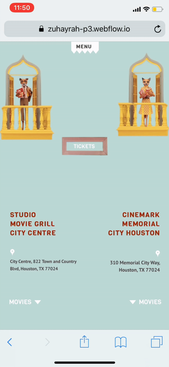
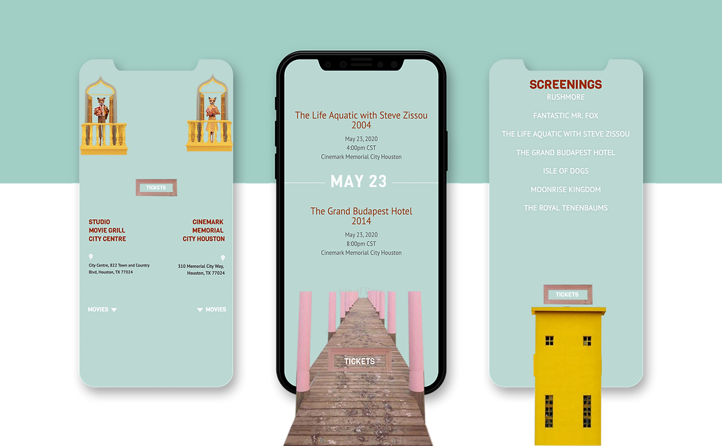

The accessibility is expressed on the ticket section, as tickets for each day is accessible all the time, in case the user decides to change their ticket.
The flat, centered aesthetic is carried through the images and type throughout all pages, including the menu page.